Today we are happy to introduce new functionalities within Graphs. Extending new possibilities for visualization of your data. Creating clarity and supporting your needs for detailed analyses. Making Growing Easier.

New Release - Customization of Graphs
New Release - Customization of Graphs
There are many useful features available in the PYLOT platform. Graphs is one of them. This functionality represents all relevant parameters, generated and calculated by your climate computer, from single or multiple locations. With Graphs you can easily combine your climate- and sensor data with your plant data. You will constantly experience user friendliness and high performance of the platform.
Today we are happy to introduce new functionalities within Graphs. Extending new possibilities for visualization of your data.
Let’s sum up the new options:
- Select your colors
- Highlighting of graph lines
- Create multiple scales
- Set scale ranges
- Set scale left or right of the graph
Select your colors
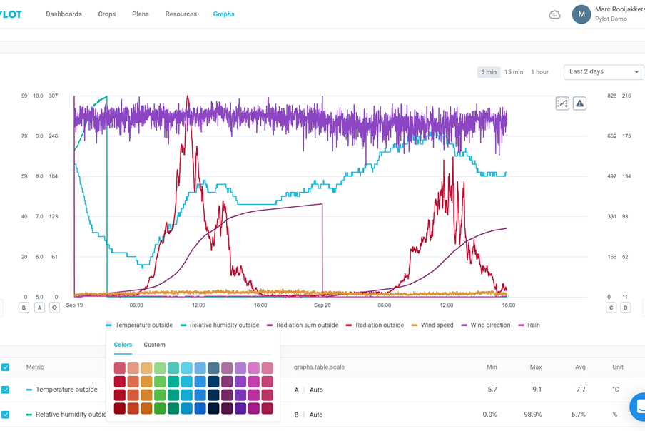
One of the new options we created, is the ability to select a color for each Graph line. You can create your own setup by selecting from 48 predefined colors or even create a custom color, adjusting it brightness and gradation.
Highlighting Graph Lines
Just select your required parameter in the series of the graph. The parameter will be emphasized in the graph. Just one click to organise.
Create multiple scales
Another improvement is the ability to add multiple scales. There are plenty daily situations, when it is needed to compare several parameters with different ranges, e.g., temperature inside (from 15oC to 25oC) and CO2 dosing level (from 400 ppm to 1200 ppm) or comparisons for sun radiation and stem diameter growth. Thanks to this update, you will be able to handle such situations. You can easily set up separate scaling for each metric or combine them. Now you really can start getting into detail.
Set scale ranges
Next to adding more scales, you can also adjust scale ranges to the level you require. Creating flexibility.
Set scale left or right of the graph
When adding these different scales, you can also position the scale left or right from the graph. Creating more and better overview.
Again an update which helps you in your daily practice. Creating insight and overview. Creating maximum flexibility in presenting your data and fulfilling your needs for analysis. Grip on Growing.

Contact one of our specialists
Fill in your contact details and questions or remarks. We will contact you soon!